Learn CSS Grid by building a simple Calculator Layout
CSS Grid is a new way of defining the structure of a webpage. It helps developers create complex layouts on the web easily without resulting to old methods such as floats or complicated frameworks which introduced all sorts of problems.
The introduction of Grid provides a system of laying out webpages that is native to web browsers and even more powerful than what you can achieve with CSS Frameworks such as Bootstrap.
In this tutorial, we will explore some of the benefits that Grid has to offer by building a simple calculator layout.
Prerequisites
You need to have some experience with CSS before taking this tutorial as I won’t be explaining the basics of CSS. I will only concentrate on the parts that are relevant to Grid layout.
I would also recommend that you use Firefox for developing with CSS Grid because it has a great Grid inspector tool that helps you discover, examine and debug Grid layout issues on a page.
To be sure, everything will still work if you decide to use Chrome. It’s just that the developement experience is much nicer in Firefox at this point in time.
What we’ll be building
I will demonstrate how you can build a simple calculator layout with CSS Grid. Here’s the live demo of the finished calculator.
I will also explain the most common terms used in Grid land, and how to use the Firefox Grid Inspector to inspect and visualise your Grid layout.
Getting Started
You can find the starter files for this tutorial on JSFiddle. It contains all the necessary markup to build the calculator layout.
Start by forking the code to a new fiddle and follow along by typing each step out all the way to the end. Feel free to do this tutorial on another online playground or on your local machine if you prefer.
The Markup
<div class="calculator">
<input type="text" class="calculator-screen" value="0" disabled />
<div class="calculator-keys">
<button type="button" class="operator" value="+">+</button>
<button type="button" class="operator" value="-">-</button>
<button type="button" class="operator" value="*">×</button>
<button type="button" class="operator" value="/">÷</button>
<button type="button" value="7">7</button>
<button type="button" value="8">8</button>
<button type="button" value="9">9</button>
<button type="button" value="4">4</button>
<button type="button" value="5">5</button>
<button type="button" value="6">6</button>
<button type="button" value="1">1</button>
<button type="button" value="2">2</button>
<button type="button" value="3">3</button>
<button type="button" value="0">0</button>
<button type="button" class="decimal" value=".">.</button>
<button type="button" class="all-clear" value="all-clear">AC</button>
<button type="button" class="equal-sign" value="=">=</button>
</div>
</div>Our calulator layout has two parts: the screen and the keys. The screen will span the full width of the calculator but it’s the keys where we’ll need to use CSS Grid since they’re arranged in a grid format.
Basic CSS Reset
I like to start my web projects with the following CSS reset:
html {
  font-size: 62.5%;
  box-sizing: border-box;
}

*, *::before, *::after {
  margin: 0;
  padding: 0;
  box-sizing: inherit;
}
This sets the margin and padding of every HTML element to zero and the box-sizing: border-box; declaration changes the box model by ensuring that the padding and border of an element no longer increases its width.
Basic Calculator Styles
Add the following styles below the reset to absolutely center the calculator on the page and give it a border and fixed width.
.calculator {
  border: 1px solid #ccc;
  border-radius: 5px;
  position: absolute;
  top: 50%;
  left: 50%;
  transform: translate(-50%, -50%);
  width: 400px;
}
The Calculator Screen
Style the calculator screen as follows:
.calculator-screen {
  width: 100%;
  font-size: 5rem;
  height: 80px;
  border: none;
  background-color: #252525;
  color: #fff;
  text-align: right;
  padding-right: 20px;
  padding-left: 10px;
}
Styling the buttons
Add the following styles for the individual buttons to improve their look a bit. I have styled the operators, All Clear and Equals button differently from the others to add some distinction.
We’ll get to the .calculator-keys container in the next section which is where all the CSS Grid work will happen.
button {
  height: 60px;
  background-color: #fff;
  border-radius: 3px;
  border: 1px solid #c4c4c4;
  background-color: transparent;
  font-size: 2rem;
  color: #333;
  background-image: linear-gradient(to bottom,transparent,transparent 50%,rgba(0,0,0,.04));
  box-shadow: inset 0 0 0 1px rgba(255,255,255,.05), inset 0 1px 0 0 rgba(255,255,255,.45), inset 0 -1px 0 0 rgba(255,255,255,.15), 0 1px 0 0 rgba(255,255,255,.15);
  text-shadow: 0 1px rgba(255,255,255,.4);
}

button:hover {
  background-color: #eaeaea;
}

.operator {
  color: #337cac;
}

.all-clear {
  background-color: #f0595f;
  border-color: #b0353a;
  color: #fff;
}

.all-clear:hover {
  background-color: #f17377;
}

.equal-sign {
  background-color: #2e86c0;
  border-color: #337cac;
  color: #fff;
}

.equal-sign:hover {
  background-color: #4e9ed4;
}
Using CSS Grid to arrange the buttons
Now to the fun part. We need to setup the .calculator-keys container to use Grid layout:
.calculator-keys {
  display: grid;
}
Any element that has its display property set to grid is known as a grid container. The direct descendants of the grid container are known as grid items. In this case, the button elements inside .calculator-keys are the grid items.
The result is that each grid item takes up the full width of the grid container. Although not the result we are looking for, this is a good start. Soon, I’ll show you how to define rows and columns in the grid container.
Before that, let’s explore how Firefox’s DevTools can make our lives easier when creating layouts with CSS Grid.
Examine Grid Layouts with Firefox DevTools
Open the Firefox DevTools using Ctrl+Shift+I in Windows and Linux or Cmd+Opt+I in macOS. Inside the Inspector pane, check out the Layout section which lists all the Grid containers on the page.
Select the div.calculator-keys grid container we just created. This draws a grid overlay around the grid container to help you visualise the layout. With the overlay activated, any changes to the grid will be easy to see.
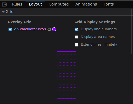
Here, you can see that we have a single column in our grid and the number of rows correspond to the number of grid items (buttons) present in the grid container.
Defining Rows and Columns
We can define rows and columns for a grid container using the grid-template-rows and grid-template-columns properties. For our calculator layout, we need to place the keys in four columns of equal width.
.calculator-keys {
  display: grid;
  grid-template-columns: 1fr 1fr 1fr 1fr;
}
The fr unit is a new form of measurement in CSS. It represents a fraction of the available space in a grid container. So 1fr means 1 part of the available space, 2fr means 2 parts, and so on.
Here, we’ve created four columns with each one taking 1 part of the available space. So each column will have the same width regardless of the size of the grid container.
We can also use the repeat keyword to define the number of columns like this:
.calculator-keys {
  display: grid;
  grid-template-columns: repeat(4, 1fr);
}
Now, each button takes a single column with additional rows created as needed.
Space out the buttons
We need to add some space between the butttons. This can be achieved using the grid-column-gap and grid-row-gap properties on the grid container.
.calculator-keys {
  display: grid;
  grid-template-columns: repeat(4, 1fr);
  grid-row-gap: 20px;
  grid-column-gap: 20px;
}
Now, we have an equal-sized gutter between the columns and the rows. Note that this gutter is not present along the edge of the grid container.
We can use the grid-gap property as a shorthand for both grid-column-gap and grid-row-gap like this: grid-gap: 20px 20px. The first value specifies the grid-row-gap while the second is the grid-column-gap. Since they’re the same value, you can just write grid-gap: 20px.
Let’s also add some space between the buttons and the edges of the grid container as well as the calculator screen. We can do this by setting a padding on .calculator-keys.
.calculator-keys {
  display: grid;
  grid-template-columns: repeat(4, 1fr);
  grid-gap: 20px;
  padding: 20px;
}
We’re getting there, but the calculator doesn’t look right yet. We need to move the Equals button to Row 2 / Column 4 and make it span four rows.
CSS Grid provides an easy way to do this using a handful of properties which we’ll examine in the next section.
Positioning the Equals Button
There are a couple of ways to put an element in a specific position on the grid. We will use grid lines to achieve what we want.
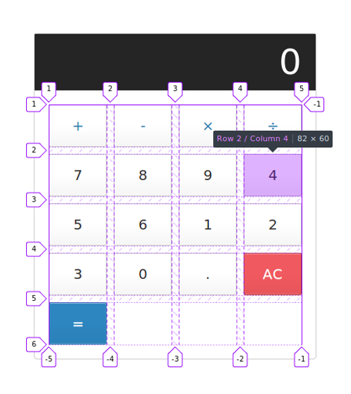
Grid lines are the dividing lines between the columns and the rows. If you inspect div.calculator keys using the Firefox Grid Inspector with the Display line numbers option turned on, you will see that we have grid lines numbered from 1 to 5 for the columns and 1 to 6 for the rows (see previous screenshot).
We can use this representation to place the Equal sign where we want it to be. The properties to use are grid-row-start, grid-row-end, grid-column-start and grid-column end.
Let’s see how they work in turn. In your CSS, add the grid-row-start property to the .equals-sign selector:
.equal-sign {
  background-color: #2e86c0;
  border-color: #337cac;
  color: #fff;
  grid-row-start: 2;
}
We have specified that the Equal sign be moved to the second grid line on the row. Since we want it to span to the last row (line 6), we’ll set the grid-row-end to 6. Also set the height to 100% so that the button stretches all the way to the end of the container.
.equal-sign {
  background-color: #2e86c0;
  border-color: #337cac;
  color: #fff;
  height: 100%;
  grid-row-start: 2;
  grid-row-end: 6;
}
Now, we have something that resembles what we are looking for, but the Equals sign is on the wrong side of the calculator. We need to move it to the last column between grid lines 4 and 5.
Here’s how to do that:
.equal-sign {
  background-color: #2e86c0;
  border-color: #337cac;
  color: #fff;
  height: 100%;
  grid-row-start: 2;
  grid-row-end: 6;
  grid-column-start: 4;
  grid-column-end: 5;
}
Tada! Now our calculator looks good to go.
We can also use grid-row and grid-column as a shorthand for grid-row-start + grid-row-end and grid-column-start + grid-column-end respectively.
.equal-sign {
  background-color: #2e86c0;
  border-color: #337cac;
  color: #fff;
  height: 100%;
  grid-row: 2 / 6;
  grid-column: 4 / 5;
}
Furthermore, these two properties can be combined into one using the grid-area property. grid-area is a shorthand for grid-row-start, grid-column-start, grid-row-end and grid-column-end in that order.
.equal-sign {
  background-color: #2e86c0;
  border-color: #337cac;
  color: #fff;
  height: 100%;
  grid-area: 2 / 4 / 6 / 5;
}
That concludes my tutorial. I hope it has helped you learn the basics of CSS Grid and how you can use it to build layouts on the web.
Grid has several other attributes that make it easier to design page layouts which I did not cover in this article. Rachel Andrew and Jen Simmons, both Grid experts, have collated tons of resources on the subject on their respective sites. CSS-Tricks also has a comprehensive guide to grid that goes into a lot more detail on each property and value.
In the next tutorial, we will bring the calculator to life using JavaScript. If you’re interested in that, you can subscribe to my newsletter to get notified when it’s out.
Thanks for reading. If this article helped you in anyway, please [consider sharing it](https://twitter.com/intent/tweet?text=Learn CSS Grid by building a simple Calculator Layout&url=https://freshman.tech/css-grid-calculator/&via=ayisaiah&related=ayisaiah). Don’t forget to ask for help in the Gitter chatroom if you get stuck.