How to build a Navigation Bar with CSS Flexbox
In the previous article, I introduced the Flexbox layout model and demonstrated how it can be used to build a photo card component, which is identical to the one found on the Unsplash homepage.
This tutorial will take you through building another real-world component with Flexbox. This time, we will recreate the navigation bar that is found on freeCodeCamp.

As usual, I have added the basic HTML and CSS for the project to JSFiddle. You can fork the code to a new fiddle or copy and paste it to your local code editor if you prefer.
The markup is simple enough; there’s an img tag for the logo and an unordered list containing the navigation links. On the freeCodeCamp website, the navigation bar is built using floats. But we can also use Flexbox to achieve the exact same result with minimal effort as you’ll see in the paragraphs below.
Let’s start by telling the browser that we want to lay out the elements in the navigation bar with Flexbox by setting the display property of the container element to flex.
.navbar {
  display: flex;
}
This makes .navbar a flex container while its direct children (.logo and .nav-links) become flex items. The navigation links are now removed from under the logo and placed level with it toward the main-start of the flex container. All the available space is pushed toward the main-end due to the default value of justify-content being flex-start.
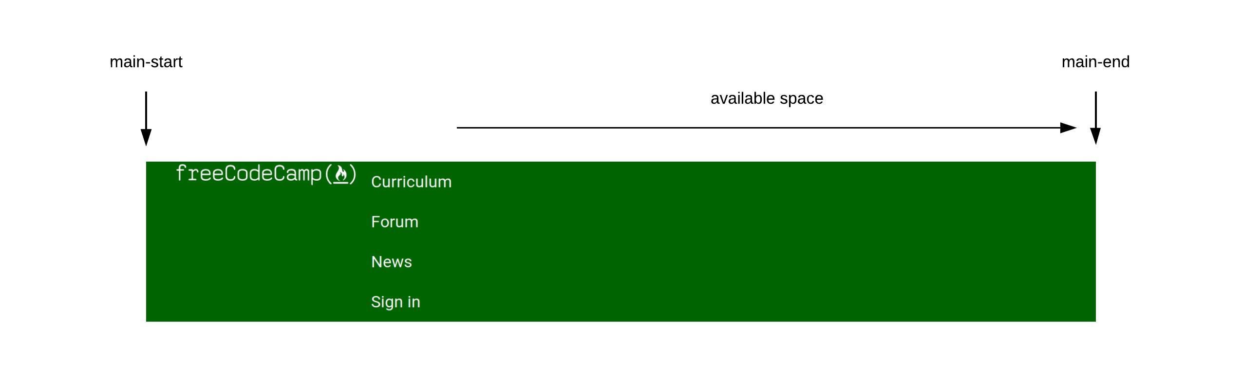
We need the available space between the logo and navigation links though, so we’re going to set the value of justify-content to space-between to achieve that.
.navbar {
  display: flex;
  justify-content: space-between;
}
That’s more like it. The first and last flex items have been packed flush against the main-start and main-end respectively, while the available space is now placed between them.
The navigation links don’t look right though. They are stacked on top of each other instead of lining up horizontally. This is due to the default styling of list items in the browser.
Let’s change that up by making .nav-links also a flex container so that all the list items within it can be laid out according to the Flexbox model.
.nav-links {
  display: flex;
}
The list items are now placed next to each other along the main-axis of .nav-links. The reason why there’s some space between each link is due to the padding declared under the .nav-item a selector.
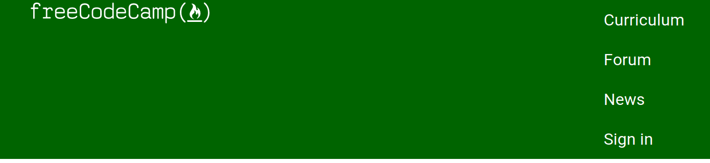
One problem remains though. The logo and navigation links are not aligned properly along the cross axis of the navigation bar. We can fix this by setting align-items to center on .navbar:
.navbar {
  display: flex;
  justify-content: space-between;
  align-items: center;
}
Now the navigation bar looks identical to the one found on the freeCodeCamp website. It was easy wasn’t it?
Conclusion
There’s more to the Flexbox layout model than the handful of properties we’ve covered so far. In the next tutorial, I’ll show you how to build a different component with some new Flexbox properties. Stay tuned!