How to build a Navigation Bar with CSS Flexbox
Learn how to use the Flexbox layout model to recreate a real-world navigation bar
In this tutorial, you will learn how to build a common component on product landing pages. Have you seen marketing pages that display feature images and their descriptions in alternating order? Flexbox makes this pattern really easy to build out, and no, you don’t have to change the HTML in order to achieve this.
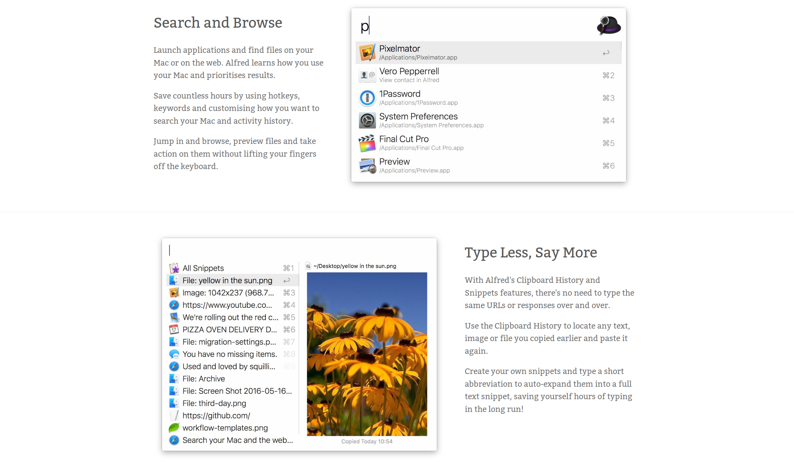
The particular feature list we’ll be building is the one found on alfredapp.com. If you inspect the elements on that site via your browser’s DevTools, you will see that the layout was achieved using floats. I’ll show you how to achieve the exact same layout with Flexbox and how to make it responsive too!
You can grab the starter code from Jsfiddle and copy it to your local text editor, or click the Fork button to fork it into a new fiddle.
If you look at the HTML pane, you will see that each feature is enclosed in a div element with a class of feature, and within it is contained the image and its description.
In the CSS pane, we have all the styles we need minus the Flexbox bits. That’s what we’re going to cover in the sections below.
The first thing we need to do is make each feature a flex container. We can do this by setting display: flex on the .feature selector.
.feature {
  padding-top: 30px;
  padding-bottom: 30px;
  display: flex;
}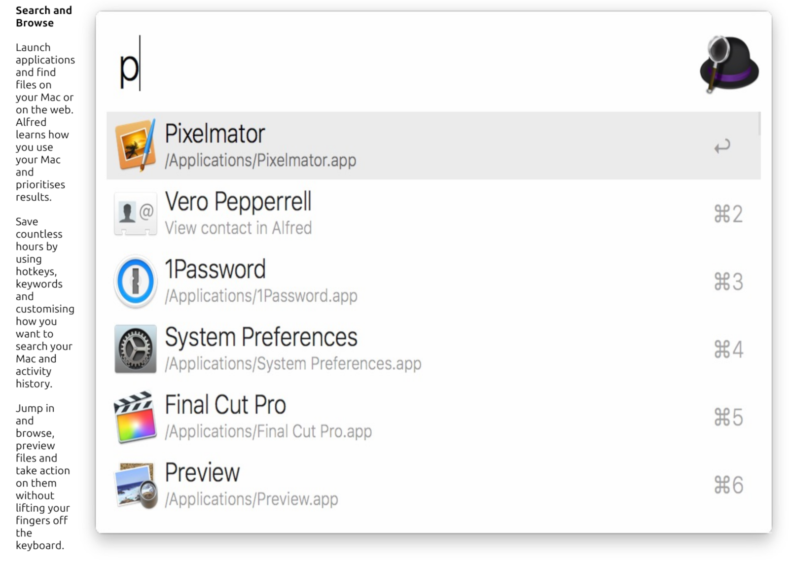
This causes the image and text to be placed flush against each other along the main axis. There is no space to distribute along the main axis since the images fill up all the available space, and the text is squished together in an unsightly manner.
We can give the images and text a consistent width using the width property as shown below:
.feature-image {
  width: 55%;
}

.feature-description {
  width: 40%;
}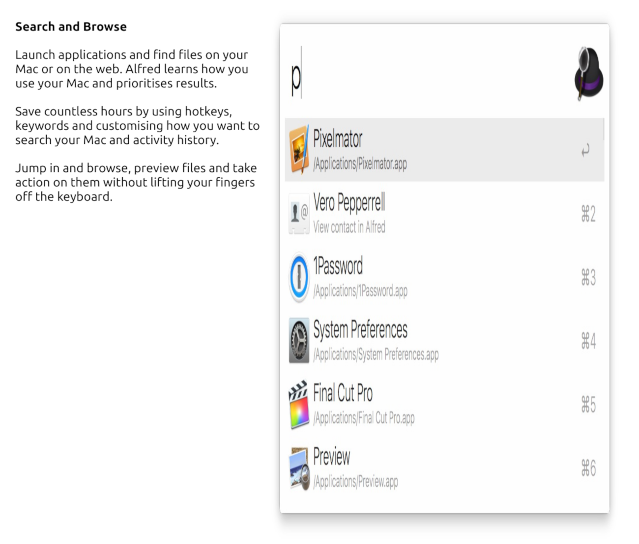
Now, the text takes up 40% of the space along the main-axis while the image takes 55% of space. This leaves 5% space which is placed at the end since the default value of justify-content on a flex container is flex-start. We can put this space between the flex items with justify-content: space-between;
.feature {
  padding-top: 30px;
  padding-bottom: 30px;
  display: flex;
  justify-content: space-between;
}
The remaining 5% space is now between the flex items. Notice that the images are really stretched out at this point. Normally, when you give an image a width or a height in CSS, the browser resizes the image so that it maintains its aspect ratio.
In this case though, the aspect ratio is ignored and the image is stretched to its full height despite the fact that we set a width of 55% on it in the CSS. The property controlling this behaviour is align-items whose default value is stretch.
We can make the browser respect the aspect ratio of the image once again by setting align-items to flex-start. Instead of stretching the flex items, they will be flushed against the start edge of the cross axis.
.feature {
  padding-top: 30px;
  padding-bottom: 30px;
  display: flex;
  justify-content: space-between;
  align-items: flex-start;
}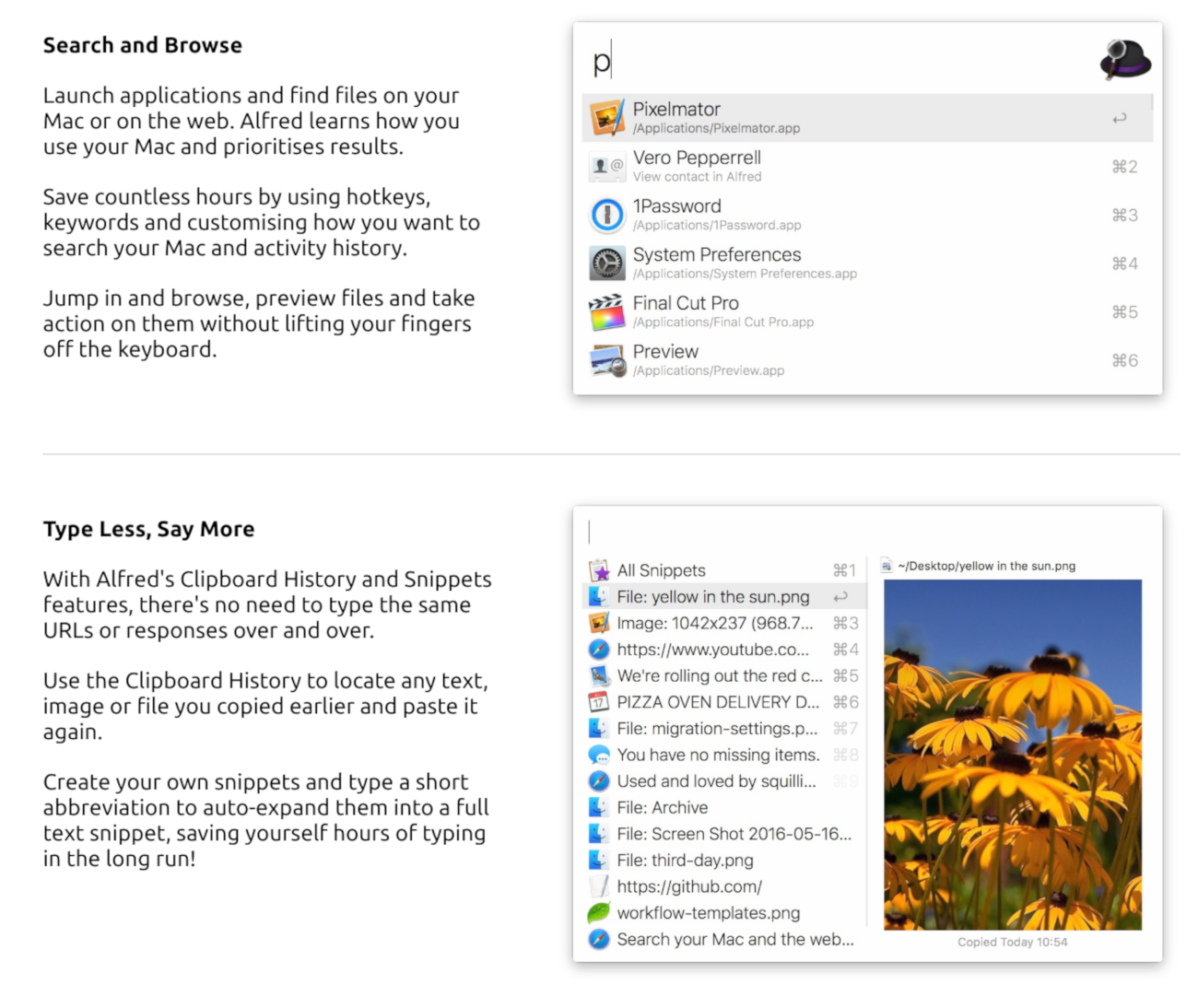
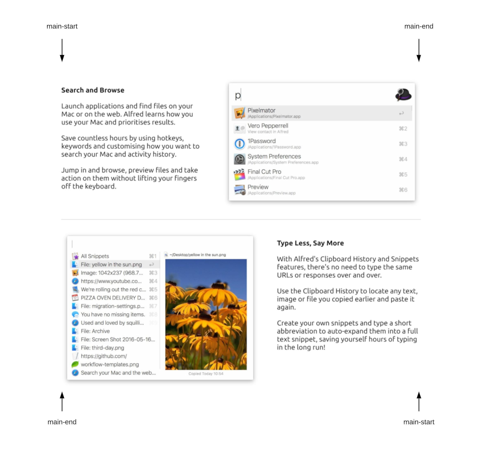
The next thing to do is to reverse the order of the flex items in the second and fouth feature list items so that the images come before the text. We can achieve that without changing our markup in any way. Notice that the second and fourth features have a class of reverse applied to them, so we can affect each one using the .reverse selector.
To reverse the arrangement of the flex items, we need to use the flex-direction property on the flex container. Its default value is row which makes the main axis go in the direction of the text (left to right in English language).
Other valid values for the flex-direction property are:
row-reverse: main axis goes from right to left.column: main axis goes in the block direction, from top to bottom.column-reverse: main axis goes from bottom to top.If we set the value of flex-direction to row-reverse, the direction of the main axis is reversed. This gives the effect of changing the order of the flex items, but really, it’s only the direction of the main axis that changed.
.reverse {
  flex-direction: row-reverse;
}
Now the feature list looks identical to what we set out to achieve, at least on the desktop view. On mobile, it doesn’t look too good yet.
You can use the Ctrl+Shift+M shortcut in Firefox or Ctrl+Shift+I followed by Ctrl+Shift+M in Chrome to see how it currently looks on a mobile screen.
We need to make sure the image and text take the full width of the viewport and that the image sits above the text.
Let’s make the image sit on top of the text first. We can do this by changing the value of flex-direction to column-reverse. This makes the main axis go from bottom to top instead of left to right.
@media screen and (max-width: 750px) {
  .feature {
    flex-direction: column-reverse;
  }
}The images now sit atop the text, but they do not take the full width of the container. This is due to the width which we set on each flex item earlier. We can easily change the width property of both the image and text to 100% so that they take the full width of the viewport.
@media screen and (max-width: 750px) {
  .feature {
    flex-direction: column-reverse;
  }

  .feature-image {
    width: 100%;
  }

  .feature-description {
    width: 100%;
  }
}Everything looks great! We’ve been able to achieve a responsive feature list using only a handful of Flexbox properties.
In this article, we’ve looked at how to use Flexbox to make a responsive feature list. If you want to practice on your own, find other websites that implement a feature list in the manner of the one we just built and try to recreate it.
In the next tutorial, I’ll cover some of the lesser understood Flexbox properties including flex-grow, flex-shrink and flex-basis, and I’ll show you how to use them to build another real world component. Till next time!
Comments
Ground rules
Please keep your comments relevant to the topic, and respectful. I reserve the right to delete any comments that violate this rule. Feel free to request clarification, ask questions or submit feedback.