How to build a responsive feature list with CSS Flexbox
Learn how to use the Flexbox layout model to recreate a real-world product feature list
CSS Flexbox has been around for quite a while now, and is well supported, but I still see a lot of upcoming web developers resorting to frameworks like Bootstrap in order to achieve simple layouts in the browser, perhaps because Flexbox introduces many new concepts that can make it difficult to use.
This article will introduce you to Flexbox by walking you through a photo card component and will teach you just enough so that you can start using it right away. I’ve got some other tutorials lined up that will go into even more detail on the subject.
Sidenote: If you haven’t learnt the basics of CSS, this tutorial is not for you as I will only explain the Flexbox related bits.
Here’s the markup for the photo card. It has two main sections: the top section where the Like and Collect buttons are placed, and the bottom section where the photographer’s name and picture as well as the download button are located.
<div class="photo">
  <div class="top">
    <button class="like-button" type="button">
      <svg fill="#f15151" class="BWSrD _2T3hc" version="1.1" viewBox="0 0 32 32" width="32" height="32" aria-hidden="false"><path d="M17.4 29c-.8.8-2 .8-2.8 0l-12.3-12.8c-3.1-3.1-3.1-8.2 0-11.4 3.1-3.1 8.2-3.1 11.3 0l2.4 2.8 2.3-2.8c3.1-3.1 8.2-3.1 11.3 0 3.1 3.1 3.1 8.2 0 11.4l-12.2 12.8z"></path>
        <span>12</span>
      </svg>
    </button>
    <button class="collect-button" type="button">
      <svg class="_2rdbO _2T3hc" version="1.1" viewBox="0 0 32 32" width="32" height="32" aria-hidden="false"><path d="M14 3h4v26h-4zM29 14v4h-26v-4z"></path></svg>
      <span>Collect</span>
    </button>
  </div>
  <div class="bottom">
    <div class="photographer">
      <img class="profile-pic" src="https://images.unsplash.com/profile-1517439422941-5c2fdfe8d883?dpr=1&auto=format&fit=crop&w=64&h=64&q=60&crop=faces&bg=fff" alt="">
      <span class="photographer-name">Mark Adriane</span>
    </div>
    <button class="download-image">
      <svg class="Apljk _11dQc" version="1.1" viewBox="0 0 32 32" width="32" height="32" aria-hidden="false"><path d="M25.8 15.5l-7.8 7.2v-20.7h-4v20.7l-7.8-7.2-2.7 3 12.5 11.4 12.5-11.4z"></path></svg>
    </button>
  </div>
</div>
Here are the styles for the card without the Flexbox bits. You can copy and paste this into your CSS file (or the CSS pane if you’re using Codepen or Jsfiddle).
html {
  box-sizing: border-box;
}

*,
*::before,
*::after {
  margin: 0;
  padding: 0;
  box-sizing: inherit;
}

.photo {
  margin: 20px auto;
  width: 416px;
  height: 640px;
  background: url("https://images.unsplash.com/photo-1539888955004-e113c5428a50?ixlib=rb-0.3.5&ixid=eyJhcHBfaWQiOjEyMDd9&s=7c6332fe301844bfb4e201cf8714b3e6&w=1000&q=80") top center no-repeat;
  background-size: cover;
  padding: 20px;
}

button {
  color: #777;
  fill: currentcolor;
  border: 1px solid transparent;
  background-color: hsla(0,0%,100%,.85);
  border-radius: 4px;
  padding: 0 11px;
}

svg {
  width: 16px;
}

a {
  text-decoration: none;
}

.top svg {
  margin-right: 5px;
}

.like-button {
  margin-right: 10px;
}

.profile-pic {
  border-radius: 50%;
  width: 32px;
  margin-right: 10px;
}

.photographer-name {
  color: #fff;
  text-transform: uppercase;
}
Our goal is to lay out the elements in the card in manner that it appears on the completed version. Let’s see how Flexbox can help us achieve that goal.
To lay out elements on a page with Flexbox, you need to subscribe to the Flexbox layout model by setting the display property of an element to flex. This affects the way its immediate children are laid out.
.photo {
  display: flex;
}
Adding display: flex; to .photo makes it a flex container and its direct children (.top and .bottom) are now flex items. This is a crucial concept to understand and remember.
An immediate effect of setting display: flex; on .photo is that the flex items are completely level against each other toward the start edge of the main axis. What is the main axis you say? Well, in Flexbox there are two axes. One is the main axis while the other is the cross axis. The direction of both axes is controlled by the flex-direction property.
By default, the flex-direction on a flex container is set to row. This makes the main axis run in the inline direction (from left to right in left-to-right languages like English), while the cross axis — which is always perpendicular to the main axis — goes in the block direction (from top to bottom).
The flex-direction property also takes some other values which we’ll explore later in the tutorial. Just know that, by default, the main axis runs from left to right while the cross axis goes from top to bottom.
The start edge of the main axis is called the main-start, while the end point is called the main-end. Similarly, the start edge of the cross axis is called the cross-start while the end point is known as the cross-end.
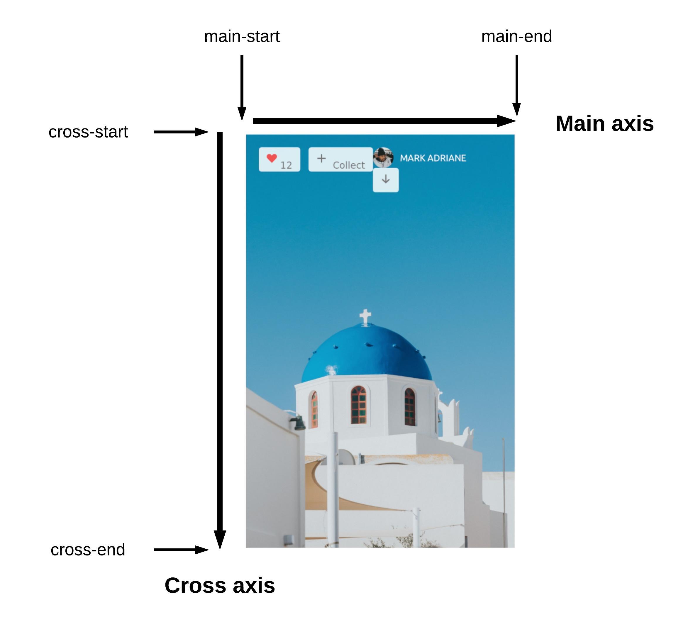
flex-direction is set to row, the main axis goes from left to right while the cross-axis goes from top to bottom
Let’s change the flex-direction of .photo to column. This changes the direction of the main axis and the cross axis which causes the layout of the flex items to shift as a result. Now, the main axis runs in the block direction from (top to bottom) while the cross axis goes in the inline direction (from left to right).
.photo {
  display: flex;
  flex-direction: column;
}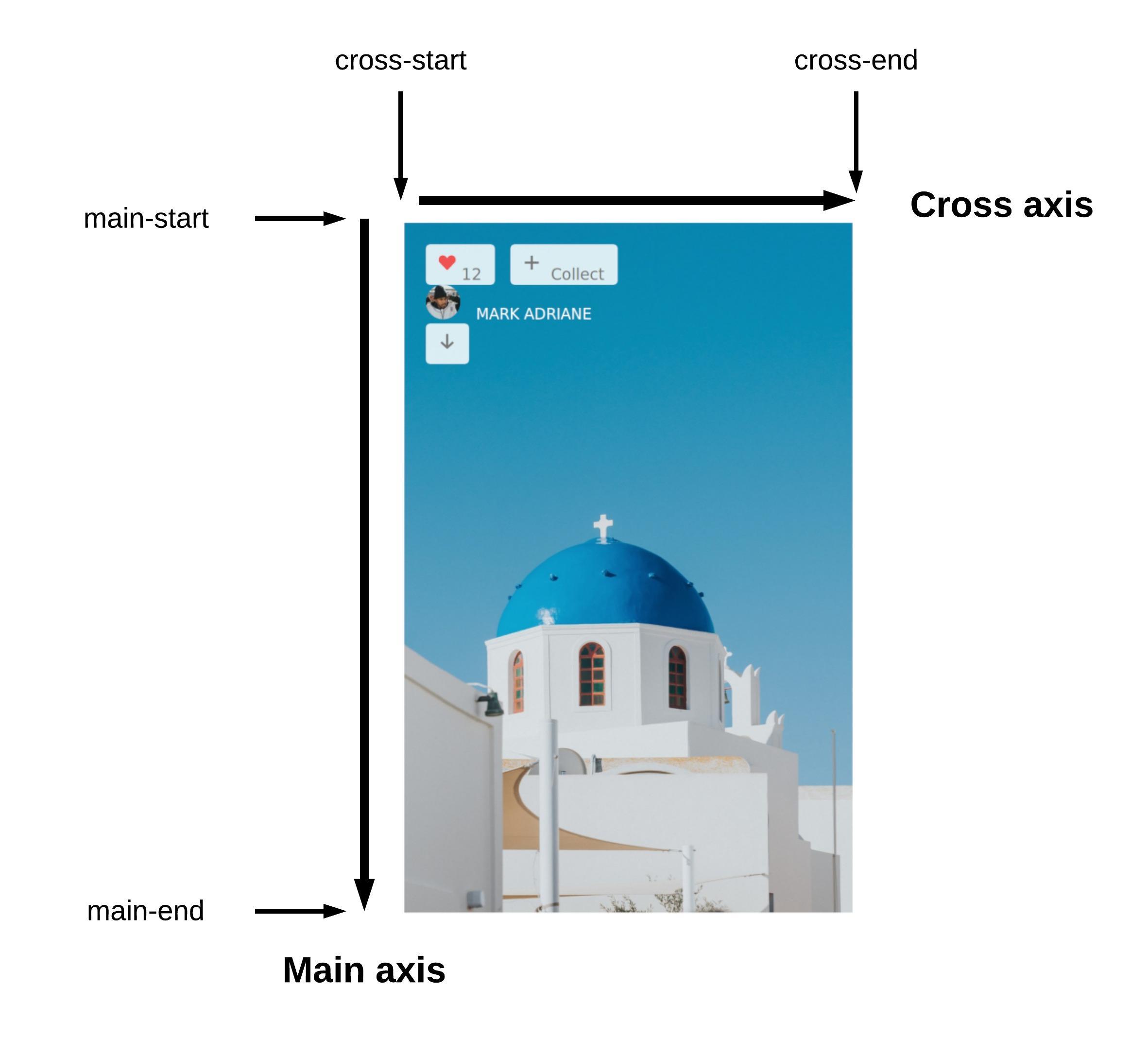
flex-direction to column causes the main axis to run in the block direction while the cross axis runs in the inline direction
At this point, the flex items (.top and .bottom) remain packed flush against the start of the main axis (main-start). But what we want is for .top to remain at top of the card, while .bottom is pushed to the to the bottom of the card.
To do this, we need to learn about a new property called justify-content. It deals with how space is distributed along the main axis of a flex container. We can distribute space however we like. However, this can only happen if there is free space to begin with. Otherwise, justify-content has no effect.
In this case, there’s plenty of space along the main axis after the flex items have been laid out. By default, the value of justify-content is set to flex-start. This is why the flex items are all packed flush against each other toward the main-start. Any remaining space is placed towards the end of the main axis.
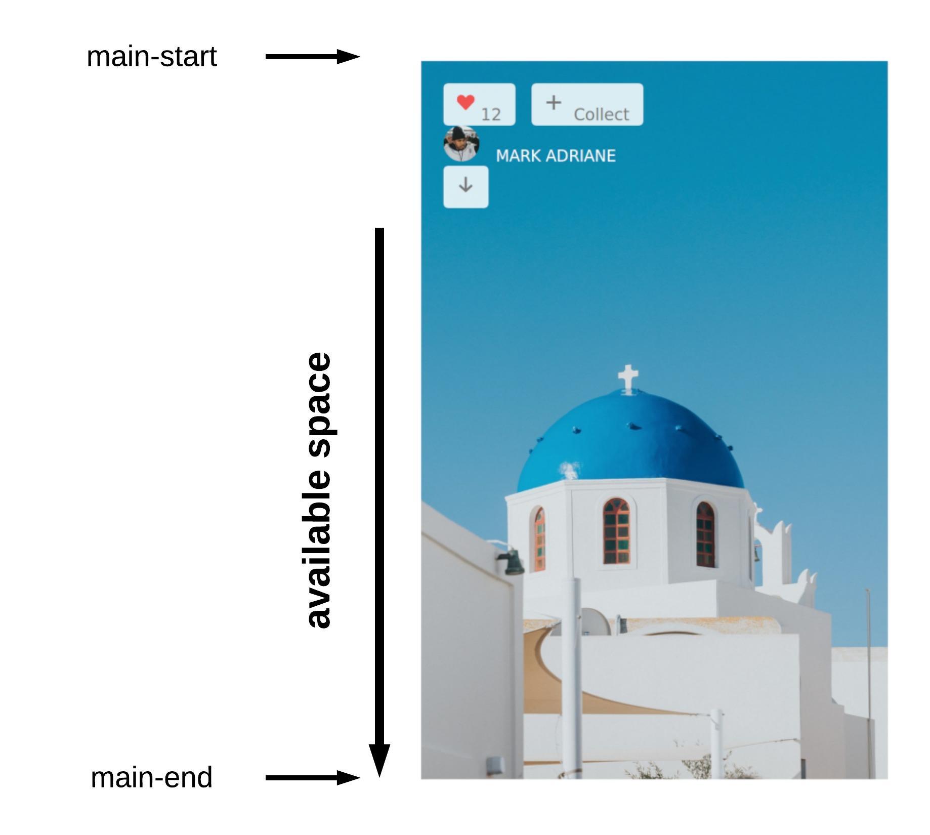
justify-content is set to flex-start, any available space is packed towards the end of the main axis
We need to distribute the space along the main axis such that all available space is between the flex items. This means that the first item will be packed flush against the main-start, while the last one will be packed flush against the main-end. The remaining space will then be distributed between the flex items. Turns out all we need to do is set justify-content to space-between on the flex container.
.photo {
  display: flex;
  flex-direction: column;
  justify-content: space-between;
}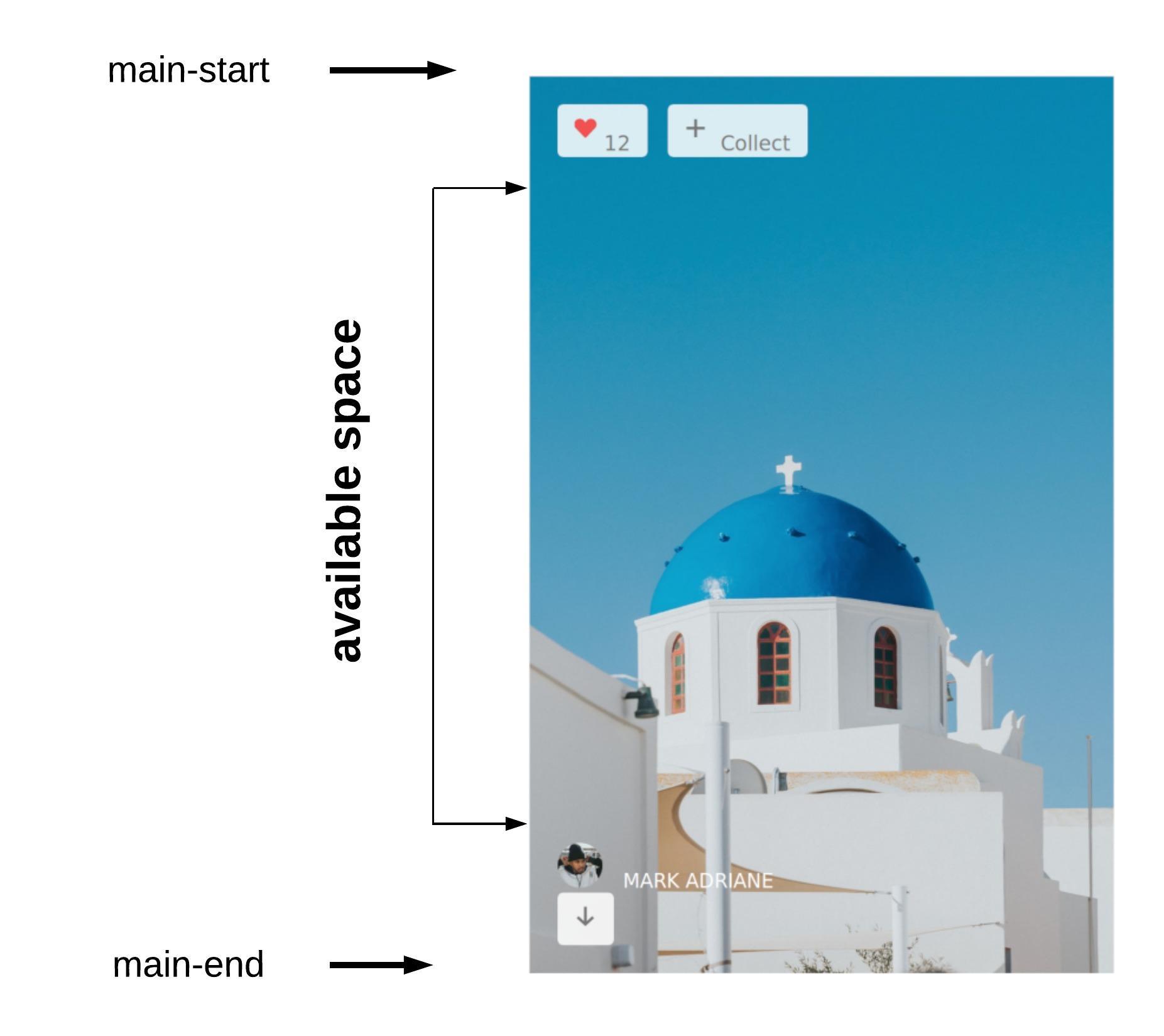
justify-content is set to space-between, any available space across the main axis is distributed evenly between the flex items
Great, that gives us the effect we were hoping for. Now, let’s fix our gaze on the elements at the top and lay them out properly. We need to move the buttons to the right, and fix the alignment within the buttons.
How can we achieve this? The trick is to make .top a flex container by setting display: flex on it. Yes you read that right. An element can be a flex item and a flex container at the same time. By doing so, its direct children (the buttons) also become flex items and can be laid out with flex properties.
.top {
  display: flex;
}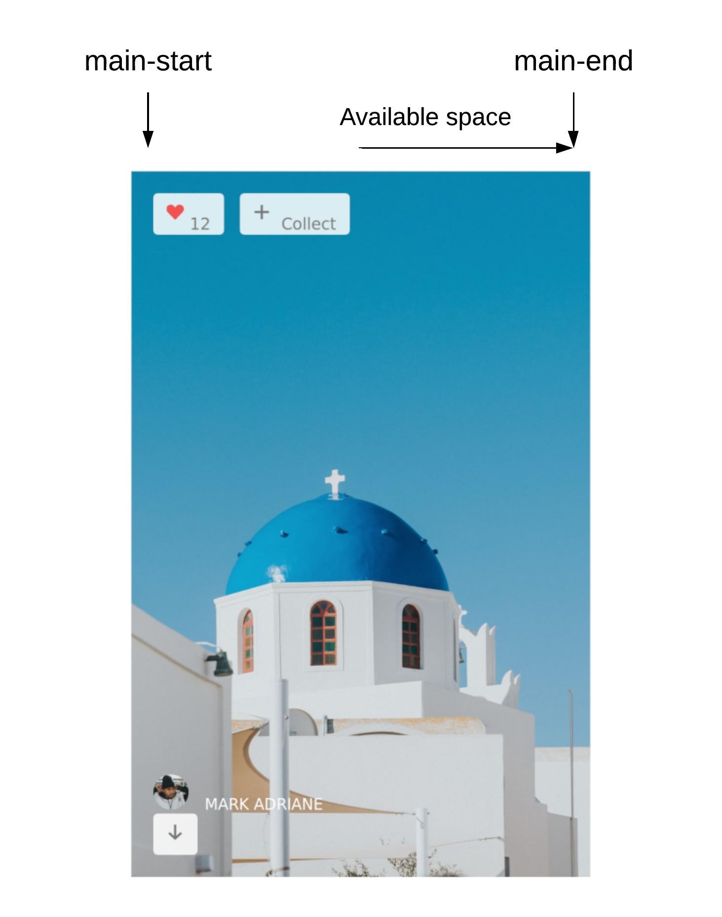
Nothing appears to have changed, but now .top also has it’s own main axis which is annotated in the image above. We can move the buttons to the right by changing how the available space is distributed along the main axis.
Specifically, instead of packing remaining space towards the end of the main axis (as is done by default), we want the flex items to be completely level against the main-end so that any remaining space is placed at the start of the main axis.
Setting justify-content to flex-end produces the desired effect.
.top {
  display: flex;
  justify-content: flex-end;
}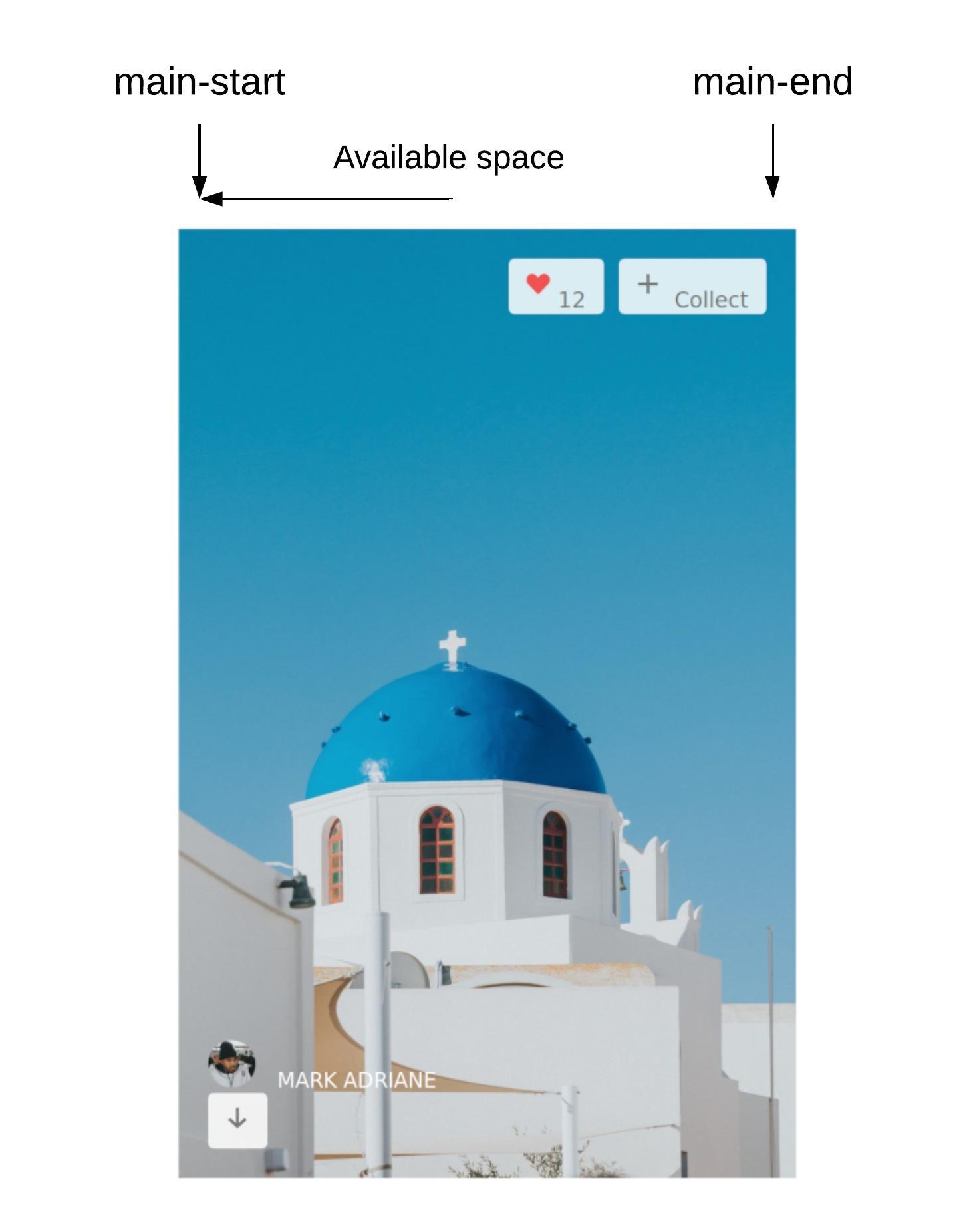
justify-content to flex-end packs the flex items flush against the main-end and distributes any available space towards the main-start
The next thing to do is to align the icons and the text in the buttons so that they line up properly. To achieve this, we need to take a look at the align-items property. But first, make each button a flex container too.
button {
  display: flex;
}The align-items property defines the behaviour for how flex items are laid out along the cross axis. You can think of it as justify-content for the cross axis. By default, the value of align-items on a flex container is stretch which causes the flex items to stretch to the height of the tallest flex item or to the height of the flex container regardless of how much content is in the item.
If you add a temporary border to the flex items, you will see that they stretch to the height of the buttons. This effect is due to what I just described above.
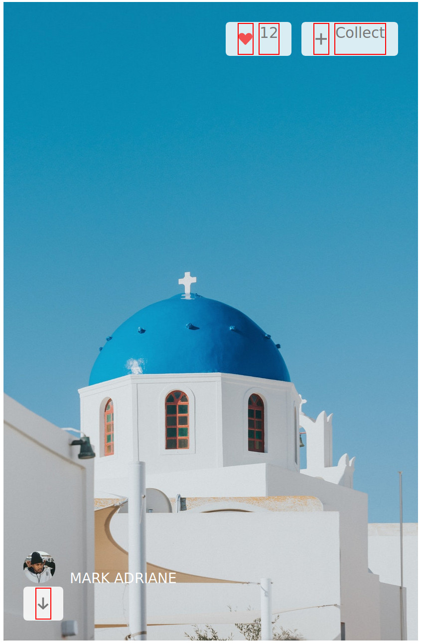
What we really want is for the flex items to be centred vertically across the cross axis. Setting the value of the align-items property to center produces the desired effect.
button {
  display: flex;
  align-items: center;
}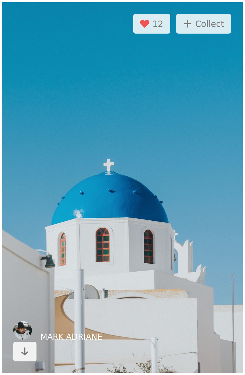
Now, the buttons look great! Let’s move on to the bottom of the card and tidy it up using the Flexbox properties that we’ve covered thus far.
Similar to what we did earlier, we’ll make .bottom a flex container by setting display: flex; on it, then we declare justify-content: space-between; to distribute the available space between the two flex items (.photographer and .download-image).
.bottom {
  display: flex;
  justify-content: space-between;
}
Finally, we need to center the photographer’s profile picture and name vertically. We can make the parent element (.photographer) a flex container and set align-items to center to vertically center the image and the text.
.photographer {
  display: flex;
  align-items: center;
}
There you have it. We’ve learnt about several Flexbox properties and achieved the photo card layout in the processs. In case you’re wondering, this photo card design and the photo itself is the derived from the Unsplash homepage.
In the next tutorial, we’ll learn about other Flexbox concepts and how to apply them by building some other UI component. If you’re interested in that, you can subscribe to my newsletter to get notified when it’s out.
Comments
Ground rules
Please keep your comments relevant to the topic, and respectful. I reserve the right to delete any comments that violate this rule. Feel free to request clarification, ask questions or submit feedback.