A Guide to Responsive Images on the Web
Responsive images explained with use cases and documented code snippets to get you started
Images are one of the most fundamental types of content that is served on the web. They say an image is worth a thousand words, but it can also be worth quite a few megabytes too if you’re not careful.
So although web images need to be clear and crisp, they must also be delivered at manageable sizes so that load times are kept small and data use is kept at acceptable levels.
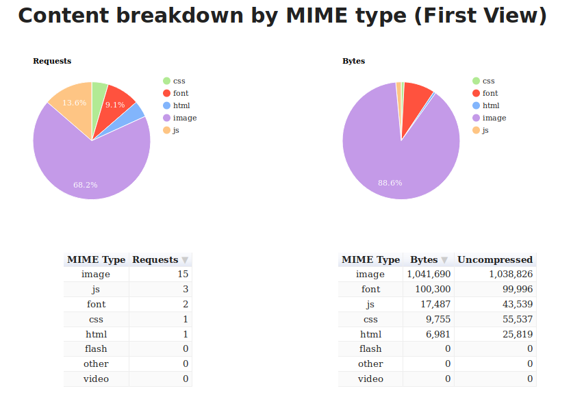
On my website, I noticed that the page weight of my homepage was over 1.1 MB and images added up to 88% of that weight. I also realised that I was serving images that were larger than they needed to be (in terms of resolution). Clearly, there was a lot of room for improvement.

I started off by reading the excellent Essential Image Optimisation ebook by Addy Osmani and proceeded to implement his recommendations on my website. Then I did some research on responsive images and applied that too.
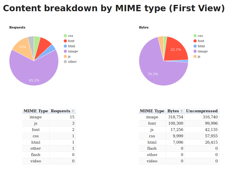
This got the page weight down to 445 KB. About 62% reduction in page weight!

This post is all about describing the steps I took to bring the page weight of my homepage to a more manageable level.
Compressing images is all about reducing file size while maintaining an acceptable level of visual quality. To compress the images on my site, imagemin was my tool of choice.
To use imagemin, make sure you have Node.js installed then open a terminal window, cd into your project’s folder and run the following command:
npm install imageminThen create a new file named imagemin.js and paste in the following contents:
const imagemin = require('imagemin');
const PNGImages = 'assets/images/*.png';
const JPEGImages = 'assets/images/*.jpg';
const output = 'build/images';
Feel free to change the values of the PNGImages, JPEGImages and output to match your project’s structure.
To perform any compression, you need to pull in a few plugins depending on the type of image you want to compress.
To compress JPEG images, I used the MozJPEG tool from Mozilla which is available as an imagemin plugin via imagemin-mozjpeg You can install it by running the following command:
npm install imagemin-mozjpegThen add the following to your imagemin.js file:
const imageminMozjpeg = require('imagemin-mozjpeg');

const optimiseJPEGImages = () =>
  imagemin([JPEGImages], output, {
    plugins: [
      imageminMozjpeg({
        quality: 70,
      }),
    ]
  });

optimiseJPEGImages()
  .catch(error => console.log(error));
You can run the script by running node imagemin.js in the terminal. This will process all of the JPEG images, and place the optimised versions in the build/images folder.
I found that setting quality to 70 produces good enough images for the most part, but your mileage may vary. Do experiment with that value as you see fit.
MozJPEG generates progressive JPEGs by default which causes images to load progressively from low resolution to higher resolutions until the picture is fully loaded. They also tend to be slightly smaller than baseline JPEGs due to the way they are encoded.
You can check whether a JPEG image is progressive or not using this nifty command line tool by Sindre Sorhus.
The pros and cons of using progressive JPEGs have been well documented by Addy Osmani. For me, I felt the pros outweighed the cons so I stuck to the default settings.
If you prefer to use baseline JPEGs instead, you can set progressive to false in the options object. Also, make sure to visit the imagemin-mozjpeg page to see other available settings you can tinker with.
pngquant is my preferred tool for optimising PNG images. You can use it via imagemin-pngquant:
npm install imagemin-pngquantThen add the following to your imagemin.js file:
const imageminPngquant = require('imagemin-pngquant');

const optimisePNGImages = () =>
  imagemin([PNGImages], output, {
    plugins: [
      imageminPngquant({ quality: '65-80' })
    ],
  });

optimiseJPEGImages()
  .then(() => optimisePNGImages())
  .catch(error => console.log(error));
I’ve found a quality level of 65-80 to provide a good compromise between file size and image quality.
With these settings, I was able to get a screenshot of my site from 913 KB to 187 KB without any discernible visual quality loss. A whooping 79% reduction!
Here are both files. Take a look and judge for yourself:
WebP is a relatively new format introduced by Google that aims to provide lower file sizes by encoding images in both lossless and lossy formats, making it a great alternative to both JPEG and PNG.
The visual quality of WebP images is often comparable to both JPEG and PNG, but usually at a much reduced file size. For example, when I converted the screenshot from above to WebP, I got an 88 KB file whose quality was comparable to the original image at 913 KB. A 90% decrease!
Take a look at all three images. Can you tell the difference?
Personally, I think the visual quality is comparable, and the savings you get is hard to ignore.
Now that we’ve established that there’s value in using WebP formats where possible, it is important to note that, at this time, it cannot replace JPEG and PNG completely since WebP support in browsers is not ubiquitous.
At the time of writing, Firefox, Safari and Edge are notable browsers without WebP support.
However, according to caniuse.com, the browsers that do support WebP are used by over 70% of users globally. This mean that, by serving WebP images, you could be making your webpages faster for around 70% of your customers.
Let’s look at the exact steps to serving WebP images on the web.
Converting JPEG and PNG images to WebP is pretty easy using the imagemin-webp plugin.
Install it by running the following command in your terminal:
npm install imagemin-webpThen add the following to your imagemin.js file:
const imageminWebp = require('imagemin-webp');

const convertPNGToWebp = () =>
  imagemin([PNGImages], output, {
    use: [
      imageminWebp({
        quality: 85,
      }),
    ]
  });

const convertJPGToWebp = () =>
  imagemin([JPGImages], output, {
    use: [
      imageminWebp({
        quality: 75,
      }),
    ]
  });

optimiseJPEGImages()
  .then(() => optimisePNGImages())
  .then(() => convertPNGToWebp())
  .then(() => convertJPGToWebp())
  .catch(error => console.log(error));
I found that setting the quality to 85 produces WebP images that are similar in quality to their PNG equivalent but drastically smaller. For JPEGs, I found that setting the quality to 75 gives me a decent balance between visual quality and file size.
To be honest, I’m still experimenting with these values so don’t take them as a recommendation. And make sure you check the imagemin-webp page to see the other options that are available to you.
Once you have your WebP images, you can use the following markup to serve them to browsers that can use them while providing the equivalent (optimised) JPEG or PNG fallback to browsers without WebP support.
<picture>
    <source srcset="sample_image.webp" type="image/webp">
    <source srcset="sample_image.jpg" type="image/jpg">
    <img src="sample_image.jpg" alt="">
</picture>
With this markup, browsers that understand the image/webp media type will download the WebP variant and display it, while other browsers will download the JPEG variant instead.
Any browser that does not understand <picture> will skip all the sources and load whatever is defined in the src attribute of the img tag at the bottom. Thus we’ve progressively enhanced our page by providing support for all classes of browsers.
Note that in all cases, the img tag is what’s actually rendered to the page, so it’s indeed a required part of the syntax. If you leave out the img tag, no image is rendered.
The <picture> tag and all sources defined within are just there so that the browser can choose which varient of the image to use. Once a source image is chosen, its URL is fed to the img tag and that’s what is displayed.
This means that you do not need to style the <picture> or source tags since those are not rendered by the browser. So you can carry on with styling just the img tag as before.
As you can see, the process of optimising images for use on the web is not so complicated and will result in a better user experience for your customers by reducing page load times. So take a few minutes today and carry out some image optimisation on your website. If you have other recommendations, be sure to mention them in the comments or on Twitter.
Thanks for reading!
Comments
Ground rules
Please keep your comments relevant to the topic, and respectful. I reserve the right to delete any comments that violate this rule. Feel free to request clarification, ask questions or submit feedback.