A Guide to Responsive Images on the Web
The process of optimising images for the web does not stop at using tools like MozJPEG or pngquant. You also need to make sure that you are serving the right images to your users depending on their device capabilities.
The concept of responsive images refers to a system for adapting images to fit the resolution, viewport and layout for any device, and it goes farther than just applying a max-width: 100% rule to the img tag.
It means not relying on browser resizing to display images on screens with varying widths or sending a high-resolution image to small devices with a low resolution display which could result in a huge waste of users’ data. After all, a screen that’s 360 pixels wide does not need a 2000px image even if it’s a 3x display.
There’s a lot to figure out when it comes to responsive images. There’s the srcset and sizes attributes, the <picture> element, and also the process of generating multiple variants of an image at different sizes, aspect ratios and for different pixel densities.
It took a while to understand all the terminology that’s out there, but I’m going to try to explain everything as best as I can.
Physical pixels vs Logical (CSS) pixels
Before we explore how srcset and sizes work, let’s examine the relationship between physical (device) pixels and logical pixels because they’re crucial to understanding how to develop an efficient responsive image solution.
Let’s say you have a Samsung Galaxy S7 Edge with a screen resolution of 1440 x 2560 pixels. This means that the device has a display that’s physically 1440px wide and 2560px tall.
Ever wonder why the following CSS media query still matches the S7 Edge’s screen?
@media (max-width: 400px) {
  h1 {
    color: red;
  }
}
Well, here’s an explanation:
Although the physical pixels of the device is 1440 x 2560, if the browser tried to use every single pixel to display content on a 5.5inch screen, the content would be far too small to see.
Which brings me to the concept of logical pixels (a.k.a CSS pixels in web development). Logical pixels are defined as the number of physical pixels in a device’s screen divided by the Device Pixel Ratio (DPR).
The DPR is defined by the device manufacturer. Simply put, it refers to the number of physical pixels contained in one logical pixel. For example, a device with a DPR of 2 means that one logical pixel contains 4 (2 x 2) physical pixels. Similarly, a DPR of 3 implies that a single logical pixel is equivalent to 9 physical pixels.
The S7 Edge has a Device Pixel Ratio of 4. This means that its logical resolution is (1440 / 4) x (2560 / 4) which gives 360 x 640 pixels. Another device, the Nexus 5, has a physical resolution of 1080 x 1920 pixels, and a DPR of 3. This puts its logical resolution at 360 x 640 pixels, same as the S7 Edge.
So when you’re defining pixel measurements in your CSS, you’re actually targeting logical resolutions not physical ones.
If you want to inspect some other devices and their pixel ratios, you can use Responsive Design Mode in both Chrome and Firefox.
In Chrome, open the DevTools, then click the device toolbar icon or hit Ctrl+Shift+M. Then use the dropdown to select the device of your choice.
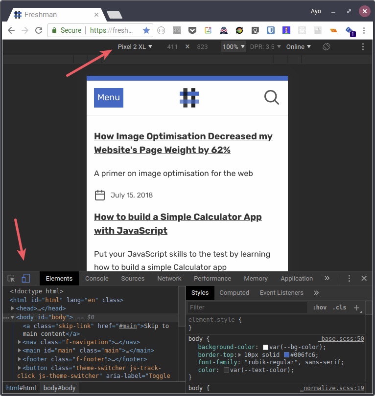
You might need to click the three dots at the top right and select “add device pixel ratio” to view the DPR for each device.
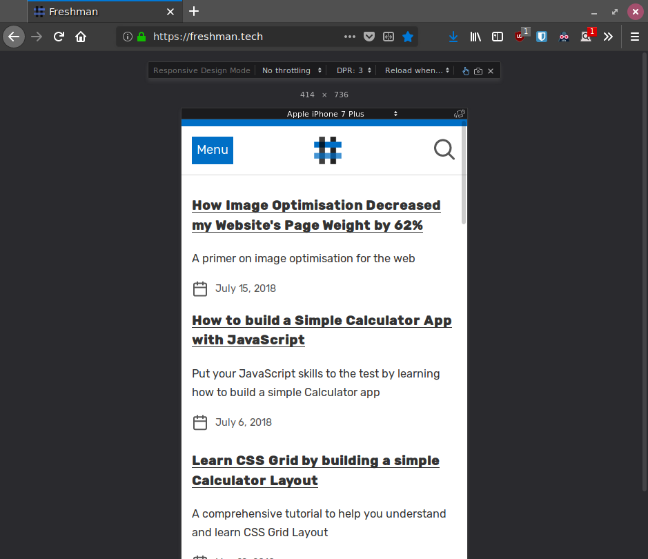
In Firefox, hit Ctrl+Shift+M to jump straight to Responsive Design Mode. Each device’s DPR and logical resolution is shown by default.
Responsive images in HTML
Here’s some markup that shows the concept of responsive images:
<img
  srcset="https://freshman.tech/assets/dist/images/star-640.jpg 640w,
    https://freshman.tech/assets/dist/images/star-960.jpg 960w,
    https://freshman.tech/assets/dist/images/star-1200.jpg 1200w,
    https://freshman.tech/assets/dist/images/star-1440.jpg 1440w"
  sizes="(max-width: 799px) calc(100vw - 40px),
    (min-width: 800px) 800px"
  src="https://freshman.tech/assets/dist/images/star-960.jpg"
  alt="A star fish in water">
If that syntax confuses you, don’t worry. It confused me too at first, but you will make sense of it soon enough.
The srcset attribute
Let’s start with the srcset attribute. It allows you to specify multiple variants of an image which the browser can choose from based on the media conditions specified in the sizes attribute. In srcset, you specify the path to each image and its physical width in pixels. Note that the image width is specified using the w descriptor as opposed to px.
In our example, we provided four image variants: one that’s 640px wide, 960px wide, 1200px wide and 1440px wide. The browser will pick only one of these variants, so which one will it pick? That’s where sizes comes in.
The sizes attribute
The sizes attribute describes the width of the image that would best fit the layout under different media conditions. Each value is a media condition followed by a CSS length that describes the width of the final rendered image when the media condition is true. You can also have a default length for when none of the media conditions match.
<img
  srcset="https://freshman.tech/assets/dist/images/star-640.jpg 640w,
    https://freshman.tech/assets/dist/images/star-960.jpg 960w,
    https://freshman.tech/assets/dist/images/star-1200.jpg 1200w,
    https://freshman.tech/assets/dist/images/star-1440.jpg 1440w"
  sizes="(max-width: 799px) calc(100vw - 40px),
    (min-width: 800px) 800px"
  src="https://freshman.tech/assets/dist/images/star-960.jpg"
  alt="A star fish in water">
The sizes attribute above specifies that when the viewport is 799px or less, the image will take the full width of the viewport minus 40px (calc(100vw - 40px)). Otherwise, at a viewport width of 800px and above, the image will take up 800px width. The reason you state the slot width is so the browser doesn’t have to download them all just to find out.
Here’s a live demo. Let’s see what image variant will be downloaded on a device with a standard resolution of 1366 x 768 pixels (a common laptop resolution).
You can use the Responsive Design Tool in your browser to simulate a laptop at this resolution, and with a Device Pixel Ratio of 1 (which means one logical pixel represents each physical pixel). Also disable the cache in the Network tab so that it does not interfere with your testing.
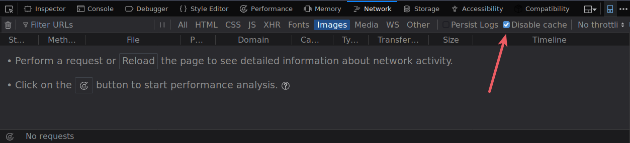
Reload the page and keep an eye on the Network tab to see what image variant was downloaded.
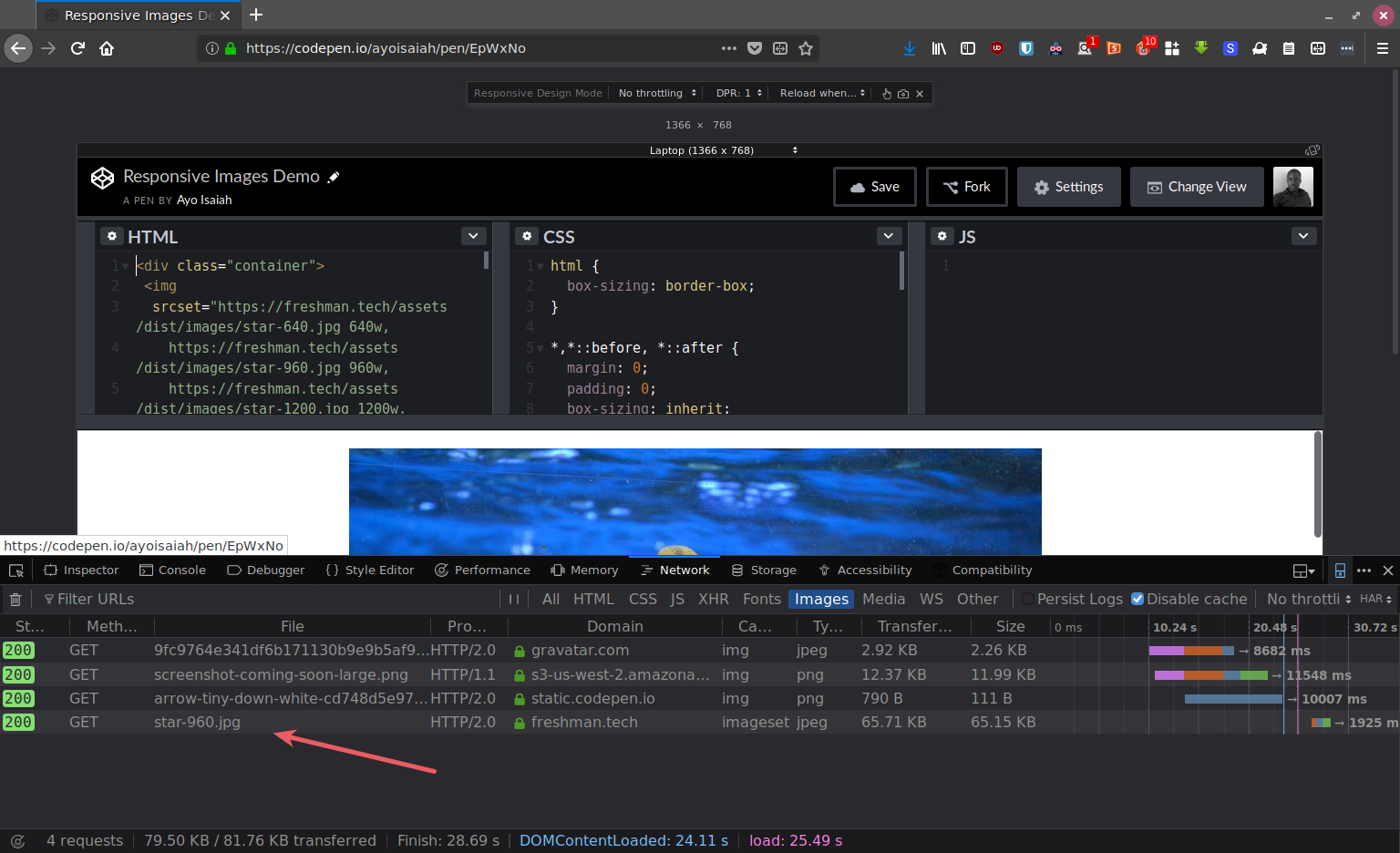
As you can see, the 960w variant is what is downloaded on this device.
How the browser chooses an image variant
For the browser to pick one of the image variants present in srcset, it needs to:
- Know the viewport dimensions and Device Pixel Ratio
- Check the media queries defined in
sizesto determine the first one that’s true - Check the size alloted to the image at that media query
- Load the most appropriate variant from the ones defined in
srcset
In the above example, the browser knows the viewport width and DPR to be 1366px and 1 respectively. It then checks the sizes attribute to see which media conditons match ((min-width: 800px)) and the slot size given to that media query (800px). Then it looks at the srcset list to find the variant that most closely matches the chosen slot size.
The 640w variant is too small so it skips over that and chooses the 960w variant which is the closest to the 800px that’s required. Browsers that do not understand both srcset and sizes will ignore the values of both attributes and download whatever you’ve specified in src.
Let’s load the demo page on some mobile devices with high resolution screens such as the S7 Edge and Nexus 5 mentioned earlier. You can simulate each device in the DevTools as before. Both devices have a logical resolution of 360 x 640 pixels, but the S7 Edge has a DPR of 4 while the Nexus 5 has a DPR of 3.
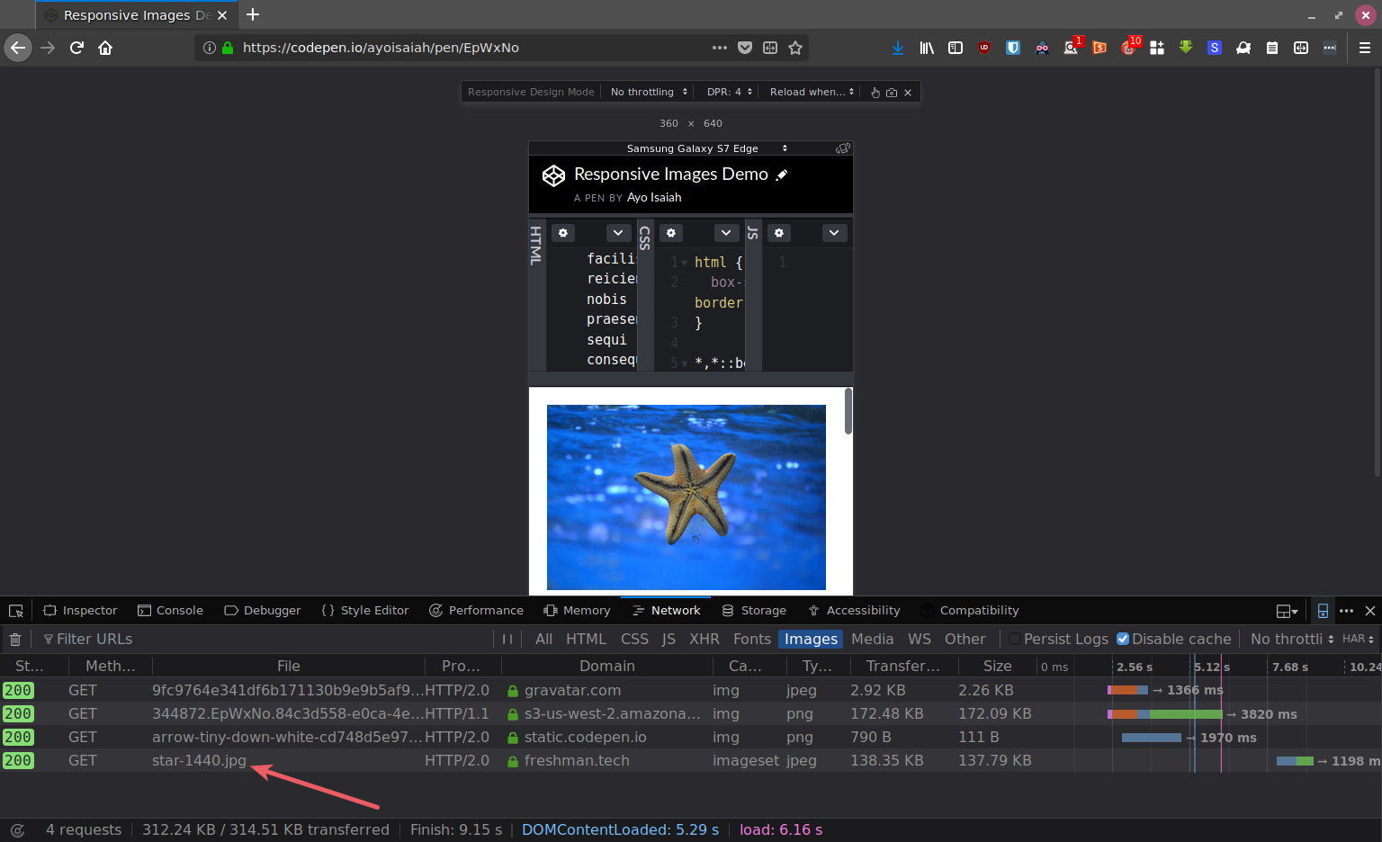
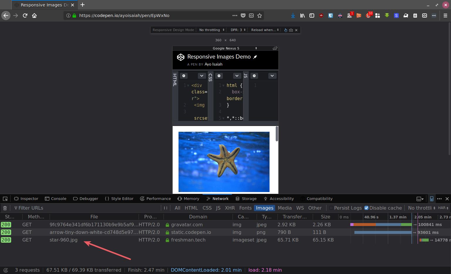
Explanation
On both devices, the logical viewport width is 360px and the matching media query is (max-width: 799px). The slot size given to the image at that condition is calc(100vw - 40px). This slot size takes into account the 20px padding on both sides of the container.
The browser calculates the slot size given to the image on both devices to be 320px (360px - 40px). It then multiplies 320px with the DPR to determine the most appropriate image that should be downloaded.
320px on a 4x display (the S7 Edge) would be 1280px. This causes the 1440w variant to be downloaded since its the closest one to that value. Similarly, on a 3x display like the Nexus 5, the browser will download the variant that’s at least 960px wide, which is why the 960w variant is downloaded.
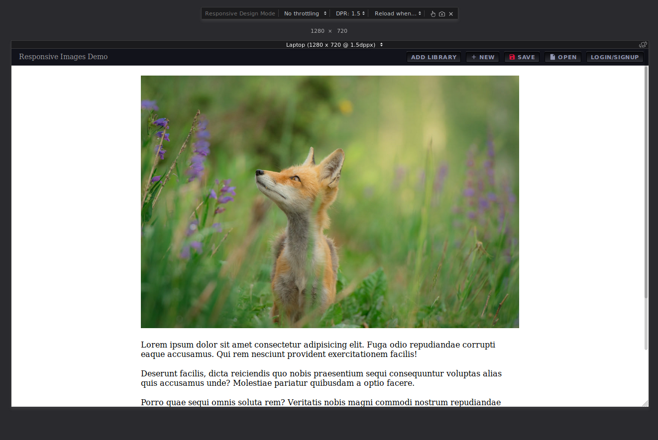
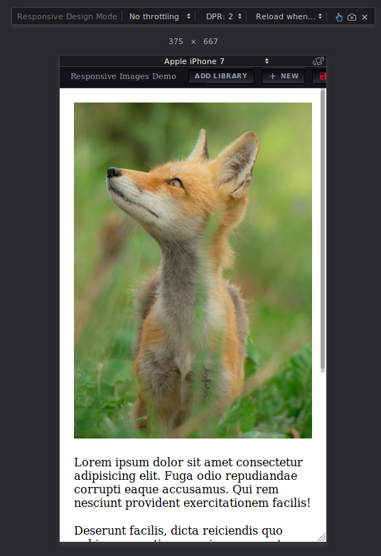
Getting sizes right
As I mentioned earlier, the sizes attribute describes the size of the image that would best fit the layout under different media conditions. The browser uses the values defined in sizes to set the intrisinc width of the rendered image.
Here’s an example that illustrates this concept:
See the Pen Sizes by Ayo Isaiah (@ayoisaiah) on CodePen.
The second image shows that the browser disregards the physical dimensions of the image in favour of what you’ve defined in the sizes attribute. If you leave out sizes entirely, as in the thrid image, the browser assumes sizes is set to 100vw which often causes the wrong image variant to be downloaded. This is why it is mandatory for sizes be present when using srcset and w descriptors. Note that you can override the intrisinc size with the width attribute and CSS as the fourth and fifth images show.
When crafting a responsive images strategy, be sure to test your sizes attribute properly. It’s preferable to set the media conditions in sizes only after your layout is done. That way, you’ll know what sizes the images need to be at various breakpoints so you can provide enough variants in srcset to ensure that there’s always one close enough to what’s required, thus minimising wasted bytes.
Type switching with picture
You are welcome to use srcset and src along with the <picture> element to provide several variants for different image formats. The type attribute lets you specify a MIME type for the images given in each <source> element’s srcset attribute. The browser loads the first source that is of a supported type.
An example is shown below:
<picture>
    <source
      srcset="sample_image-480.webp 480w,
      sample_image-768.webp 768w,
      sample_image-1024.webp 1024w"
      sizes="(max-width: 480px) 480px,
      (max-wdith: 800px) 750px,
      1024px" type="image/webp">
    <source srcset="sample_image-480.jpg 480w,
      sample_image-768.jpg 768w,
      sample_image-1024.jpg 1024w"
    sizes="(max-width: 480px) 480px,
      (max-wdith: 800px) 750px,
      1024px"
    type="image/jpg">
    <img src="sample_image-1024.jpg" alt="">
</picture>
This snippet provides an image in WebP format to browsers that support that format and, at the appropriate sizes, with JPEG fallbacks for all other browsers.
Art direction
Art direction refers to the case of adapting the contents of an image or its aspect ratio to better fit a responsive layout breakpoint. A common example is when images are displayed in their full glory on the desktop, but cropped on mobile to get rid of the irrelevant parts and focus on the main subject of the image.
Here’s the markup used to achieve the above:
<picture>
  <source
    media="(min-width: 800px)"
    srcset="fox-large.jpg">
  <source
    srcset="fox-portrait.jpg">
  <img
    src="fox-large.jpg" alt="A fox in a meadow">
</picture>
The media attribute lets you defines a media query that the browser will evaluate to select a <source> element. The source order matters as the browser will pick the first media query that matches.
In the above snippet, browsers with a width of 800 logical pixels and above get the wider landscape image, while smaller browsers get the close up photo. As before, browsers that don’t support <picture> will fallback to whatever is defined in the src attribute of the <img> tag.
Conclusion
Optimising your images and crafting a responsive images solution can take a lot of time and effort, and it is difficult to do it right.
You can have several <source> elements and combine the type attribute with media, srcset, and sizes to generate a huge amount of markup for a single image. Here’s an example that shows just how far you can take it:
<picture>
	<source
		media="(min-width: 1280px)"
		sizes="50vw"
		srcset="image-landscape-200.webp 200w,
				image-landscape-400.webp 400w,
				image-landscape-800.webp 800w,
				image-landscape-1200.webp 1200w,
				image-landscape-1600.webp 1600w,
				image-landscape-2000.webp 2000w"
		type="image/webp">
	<source
		sizes="(min-width: 640px) 60vw, 100vw"
		srcset="image-portrait-200.webp 200w,
				image-portrait-400.webp 400w,
				image-portrait-800.webp 800w,
				image-portrait-1200.webp 1200w,
				image-portrait-1600.webp 1600w,
				image-portrait-2000.webp 2000w"
		type="image/webp">
	<source
		media="(min-width: 1280px)"
		sizes="50vw"
		srcset="image-landscape-200.jpg 200w,
				image-landscape-400.jpg 400w,
				image-landscape-800.jpg 800w,
				image-landscape-1200.jpg 1200w,
				image-landscape-1600.jpg 1800w,
				image-landscape-2000.jpg 2000w">
	<img
		src="image-portrait-400.jpg" alt=""
		sizes="(min-width: 640px) 60vw, 100vw"
		srcset="image-portrait-200.jpg 200w,
				image-portrait-400.jpg 400w,
				image-portrait-800.jpg 800w,
				image-portrait-1200.jpg 1200w,
				image-portrait-1600.jpg 1600w,
				image-portrait-2000.jpg 2000w">
</picture>
Fortunately, there are some tooling around image optimisation and responsive images that can take care of all this for you. If images are a crucial part of your setup, it might be better to outsource this work to a third-party service. A few options in this space are Cloudinary, Imgix, and Piio.
If you insist on rolling out your own solution, sharp is a fast Node.js module that can help you convert large images in common formats to web friendly versions of varying dimensions.
If you have other recommendations, be sure to mention them in the comments or on Twitter.
Thanks for reading!